
If you are wondering what should go on a small business homepage, start with the questions a first-time visitor needs answered.
A homepage does not need to explain everything about the business. Its job is to quickly help visitors understand what the business does, who it is for, why they should keep reading, and where they should go next.
That sounds simple, but homepages often become cluttered because businesses try to put every service, achievement, image, testimonial, promotion, and company detail on the same page.
A useful homepage is more selective.
It gives visitors enough information to understand the business and then provides clear routes to more detailed pages.
This guide explains the sections that belong on most small business homepages, what each section should accomplish, and what you can usually leave out.
Start With the Homepage’s Job
Before deciding which sections to add, decide what the homepage is supposed to do.
For most small businesses, the homepage has four basic jobs:
- Explain what the business offers.
- Help the right visitor recognize that the business may be relevant to them.
- Build enough confidence for the visitor to continue.
- Direct the visitor toward an appropriate next step.
That next step will vary.
A visitor might:
- view a service;
- browse products;
- request a quote;
- make a booking;
- see previous work;
- find a location;
- read more about the company;
- call the business;
- send an inquiry.
The homepage should make these routes easy to find.
It does not need to contain every detail required to complete every possible customer journey.
Think of the homepage as a well-organized entrance rather than the entire building.
1. A Clear Opening Section
The top section of the homepage is usually the first thing visitors see.
It should answer the most important question quickly:
What does this business actually do?
A useful opening section commonly includes:
- a clear main heading;
- a short supporting explanation;
- a relevant image or visual;
- one primary action.
For example, compare these two headings:
Helping You Achieve More
and:
Residential Plumbing Services in Austin
The first might sound polished, but it does not tell a new visitor much.
The second immediately provides useful information.
A visitor can understand:
- the type of service;
- the audience;
- the location.
Your exact wording will depend on the business, but clarity usually matters more than cleverness.
What should the main heading say?
A homepage heading often works best when it communicates some combination of:
- what you provide;
- who you provide it for;
- where you provide it;
- what problem you solve.
It does not have to contain all four.
For example:
Bookkeeping for Small Businesses
Custom Cakes for Weddings and Events
Commercial Cleaning for Offices in Manchester
Online Piano Lessons for Adult Beginners
Each one gives visitors a useful starting point.
The heading should not force someone to read three additional paragraphs just to understand the business.
2. A Short Explanation of the Business
The headline rarely needs to tell the entire story.
A short supporting paragraph can explain the offer more clearly.
This might answer:
- What do you specialize in?
- Who normally hires you?
- What makes the service useful?
- Where do you operate?
- Is the service local, remote, or online?
Keep this introduction focused.
The homepage is not usually the right place for the full company history.
For example:
We provide bookkeeping and payroll support for small businesses that want accurate records without managing everything themselves.
That single sentence says more than several paragraphs of vague marketing language.
Visitors can always go to the About page for the longer story.
3. One Obvious Primary Action
After explaining what the business does, give visitors a logical next step.
This is often presented as a button or prominent link.
Examples include:
- View Services
- Request a Quote
- Book an Appointment
- Browse Products
- See Our Work
- Check Availability
- Contact Us
The best action depends on how ready a typical visitor is when they arrive.
A visitor researching an expensive professional service may not be ready to “Buy Now.”
A visitor ordering takeaway food may be perfectly ready to “Order Online.”
The action should match the normal buying process.
Avoid too many competing actions
A homepage opening section with five equally prominent buttons can make the visitor decide too much too early.
For example:
Get Started | Learn More | View Services | Contact Us | See Pricing
Some of these may be useful elsewhere on the page, but making all of them equally prominent can weaken the hierarchy.
Choose the most important action first.
Secondary routes can appear naturally throughout the rest of the homepage.
4. A Simple Overview of Your Main Services or Products
Once visitors understand the business, many will want to know what is actually available.
For a service business, the homepage might show three to six main services.
For example:
Lawn Care
Routine mowing, edging, cleanup, and seasonal maintenance.
Garden Design
Planning and planting for residential outdoor spaces.
Patio Installation
Hardscape installation for patios and outdoor seating areas.
Each service can then link to a dedicated page if more explanation is needed.
You do not have to reproduce every detail from the service pages on the homepage.
The homepage version should help people identify the service that interests them.
What if you offer many services?
Do not turn the homepage into a catalogue containing twenty service descriptions.
Group related services where possible.
For example:
Home Cleaning
- Regular cleaning
- Deep cleaning
- Move-in cleaning
Commercial Cleaning
- Office cleaning
- Retail cleaning
- Scheduled maintenance
This is easier to scan than giving every minor variation equal prominence.
5. A Reason to Choose the Business
After visitors understand what you offer, a natural question is:
Why this business rather than another one?
This section does not need exaggerated claims.
It should explain practical differences that matter to customers.
Examples might include:
- a particular specialization;
- years of relevant experience;
- local knowledge;
- a clear process;
- specific qualifications;
- fast response times if genuinely offered;
- custom work instead of standardized packages;
- support for a particular type of customer;
- transparent service boundaries.
For example:
Specialized in older properties
may be useful information for someone hiring an electrician.
Evening appointments available
may matter to busy customers.
Designed specifically for independent restaurants
may help a software consultant demonstrate specialization.
Specific information is usually more convincing than generic statements such as:
- Best quality
- Outstanding service
- Industry-leading solutions
- Customer-focused
- Professional results
Almost any business could make those claims.
6. Proof That the Business Is Real and Credible
Visitors who discover a small business online may know nothing about it.
The homepage should provide enough evidence to reduce uncertainty.
Useful forms of trust can include:
- customer reviews;
- testimonials;
- photographs of real work;
- case studies;
- recognized qualifications;
- certifications;
- professional memberships;
- client logos where appropriate and permitted;
- years in business;
- number of completed projects, if accurate and meaningful;
- links to independent review platforms.
The right evidence depends on the business.
A builder may benefit from photographs of completed work.
An accountant may benefit more from qualifications and clear professional experience.
A restaurant can rely heavily on real food photography, location information, and customer reviews.
A software company may use customer examples, product screenshots, and documented capabilities.
Do not invent credibility
Avoid displaying numbers simply because large numbers look impressive.
Statements such as:
Trusted by 10,000+ businesses
should only appear if they are true and defensible.
A new company is better served by presenting smaller amounts of genuine evidence than by creating vague or misleading claims.
7. Examples of Work When They Help the Decision
Some businesses are highly visual.
For those businesses, examples can be one of the most useful parts of the homepage.
Examples include:
- completed renovations;
- landscaping projects;
- hairstyles;
- photography;
- interior design;
- websites;
- custom furniture;
- cakes;
- artwork;
- product installations.
You usually do not need to put the entire portfolio on the homepage.
Choose a few representative examples and provide a route to see more.
For businesses where visual examples are less useful, this section can instead show outcomes, use cases, or short case studies.
The question is:
What evidence would help a visitor understand the quality or relevance of the work?
Use that instead of forcing every website into the same portfolio format.
8. A Short Explanation of How the Process Works
Visitors may understand the service but still hesitate because they do not know what happens after they contact the business.
A simple process section can remove some of that uncertainty.
For example:
1. Tell Us What You Need
Send the basic details of the project.
2. Get an Estimate
The requirements are reviewed and the scope is confirmed.
3. Schedule the Work
Choose an available date.
4. Complete the Project
The work is carried out and checked.
The exact steps will obviously vary.
The purpose is not to document every internal procedure.
It is to show visitors what the experience will roughly look like.
This is especially useful when the service is unfamiliar, expensive, customized, or involves several stages.
9. Information About Who the Business Is For
Some businesses serve almost everyone.
Others are much more specific.
If your ideal customer is important to understanding the offer, say so.
Examples:
For landlords and property managers
For restaurants with one to five locations
For first-time home buyers
For small online retailers
For businesses with 10–50 employees
This can help the right visitor recognize themselves quickly.
It can also prevent inquiries from people who need something the business does not offer.
You do not necessarily need a separate section titled “Who We Serve.”
Sometimes this information belongs naturally in the heading, introduction, service descriptions, or examples.
10. A Short About Section
People often want to know who they are dealing with, particularly when the business provides a personal or high-trust service.
The homepage can include a short introduction to the company or person behind it.
This might include:
- who you are;
- what you specialize in;
- how long you have worked in the field;
- what type of customers you help;
- where you operate.
Keep it brief.
The goal is not to duplicate the About page.
For example:
Northside Renovations is a family-run contractor serving residential properties across the Leeds area, specializing in kitchens, bathrooms, and interior renovations.
That is enough for the homepage.
Visitors who want the background story can continue to the About page.
11. Frequently Asked Questions When They Remove Real Obstacles
A short FAQ section can be valuable near the lower part of a homepage.
Do not add random questions just to make the page longer.
Choose questions that visitors genuinely need answered before taking the next step.
Examples might include:
- Which areas do you serve?
- Do you provide free estimates?
- How far in advance should I book?
- Do I need to provide materials?
- Do you work with commercial customers?
- Can the service be completed remotely?
- What information should I send before requesting a quote?
If the business has many questions, keep the homepage FAQ short and link to a dedicated FAQ page.
The homepage should answer the most important barriers, not become the company’s complete support database.
12. Location and Service Area Information
For local businesses, location information should not be difficult to find.
Depending on the business, the homepage might include:
- city or region;
- service area;
- shop or office address;
- opening hours;
- map;
- phone number;
- directions.
A business with a physical storefront may need a full address and opening hours.
A mobile service business may only need to explain which towns or regions it covers.
An online business may not need a customer-facing physical location at all.
Include the information that helps customers decide whether they can actually use the business.
13. Contact Information
Do not make visitors search the entire website for a way to contact you.
Depending on the business, useful contact options might include:
- contact form;
- phone number;
- email address;
- booking system;
- physical address;
- messaging option.
Not every channel needs to be displayed.
A business that handles inquiries primarily through a form does not need to add five messaging apps just because other websites do.
Offer the contact methods you can reliably monitor and respond to.
Contact information commonly appears near the bottom of the homepage and again in the website footer.
14. A Clear Final Next Step
When someone reaches the bottom of a homepage, do not leave them at a dead end.
Give them a reasonable next action.
For example:
- Request a Quote
- View Services
- Book an Appointment
- Contact Us
- Browse the Store
- See Available Classes
This does not need to be aggressive.
It simply gives visitors a clear route forward after they have finished reading.
The action should be consistent with the rest of the page.
If the homepage has spent most of its time educating someone about a complex service, suddenly ending with “Buy Now” may feel disconnected.
Match the action to the normal decision process.
15. A Useful Footer
The footer is technically part of the site-wide structure rather than only the homepage, but it matters because every homepage ends there.
A simple small business footer often contains:
- business name;
- primary navigation;
- contact information;
- location where relevant;
- privacy policy;
- terms or other legal pages where needed;
- copyright information;
- social links if those accounts are actively used.
The footer can also provide links that are useful but not important enough for the main navigation.
Avoid turning it into a second homepage.
Its role is to make useful secondary information easy to reach.
A Simple Homepage Structure
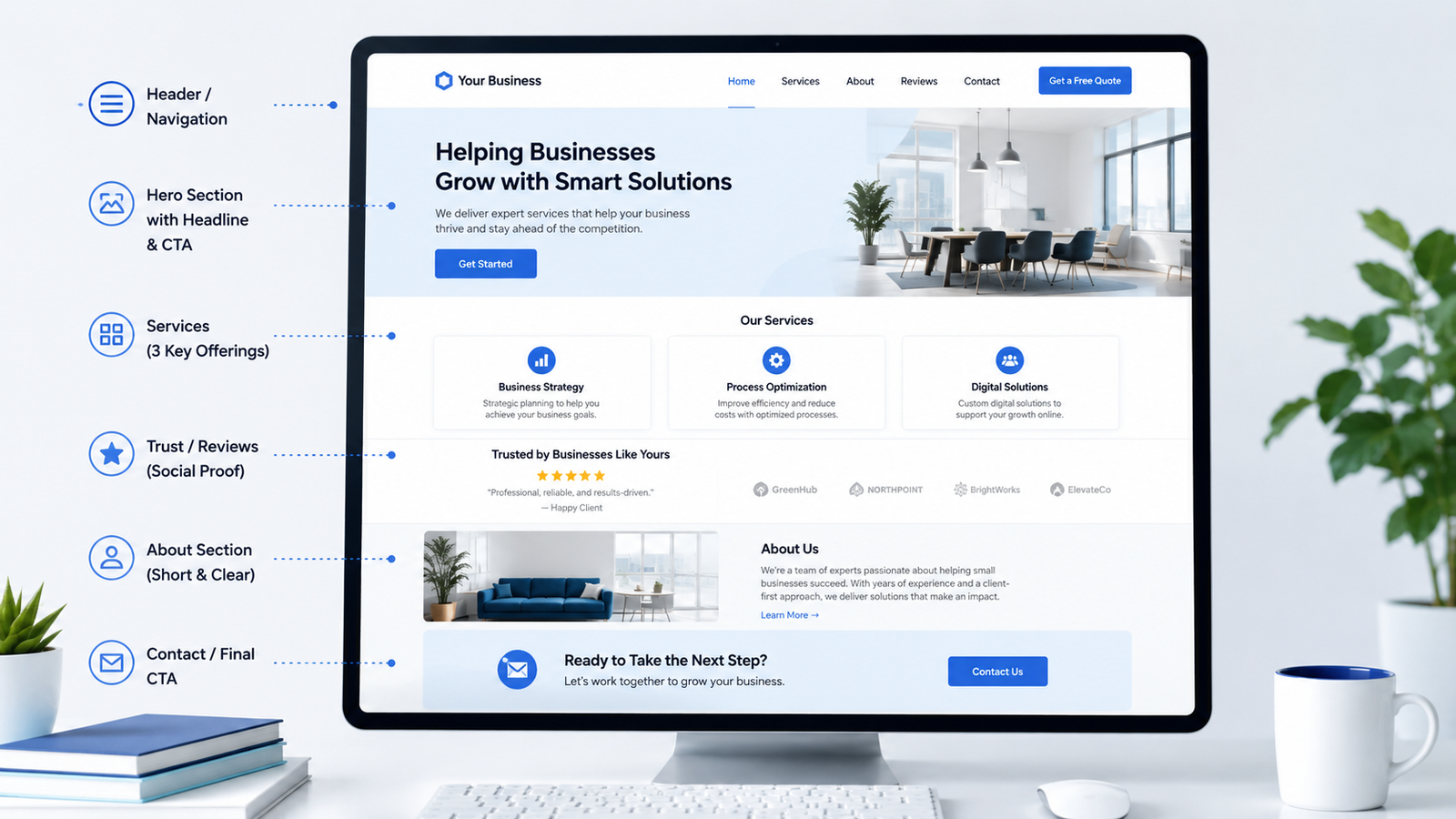
There is no universal homepage layout, but a straightforward small business homepage might follow this order:
1. Opening section
What you do, who it is for, and the main action.
2. Services or products
A quick overview of the main things you offer.
3. Why choose the business
Practical reasons someone might prefer your approach.
4. Proof or examples
Reviews, work samples, credentials, or relevant evidence.
5. How it works
A simple explanation of the customer process.
6. About
A short introduction to the business.
7. FAQ
Answers to important questions.
8. Contact or final action
A clear way to continue.
9. Footer
Useful navigation, contact, and legal information.
This is a starting framework, not a fixed template.
A restaurant homepage may place the menu and opening hours near the top.
A photographer may show work almost immediately.
A consultant may need to explain the problem they solve before listing services.
An ecommerce homepage may prioritize product categories, featured products, shipping information, and promotions.
Structure should follow visitor needs.
What Does Not Need to Be on the Homepage?
Knowing what to leave out is just as important as knowing what to include.
Every detail about every service
The homepage should summarize.
Detailed service pages can handle specifications, processes, options, eligibility requirements, and other deeper information.
The entire company history
A short introduction can build trust.
A long history belongs on the About page if visitors actually need it.
Every testimonial you have ever received
A few strong, relevant examples are usually easier to read.
A dedicated reviews or case study section can contain more.
Every blog article
The homepage may show several useful or recent articles, but it does not need to become the blog archive.
Every possible navigation link
The main homepage experience should remain understandable.
Less-important destinations can live in dropdown menus, contextual links, or the footer.
Large blocks of generic marketing language
Sentences that could appear on almost any company’s website rarely help visitors make decisions.
Replace general claims with concrete information.
Instead of:
We deliver innovative solutions that exceed expectations.
Explain what the business actually does differently.
Should the Homepage Include Pricing?
Sometimes.
Whether pricing belongs on the homepage depends on how the business sells.
Pricing can make sense when:
- the offer is standardized;
- prices are simple;
- visitors compare options based partly on price;
- the business already publishes prices openly.
It may be less suitable when:
- every project requires a custom scope;
- prices vary significantly based on requirements;
- the visitor needs more context before a number is meaningful.
Even when prices are public, the full pricing structure does not necessarily have to appear on the homepage.
A short starting point or a link to a dedicated pricing page may be easier to understand.
The important principle is not “always show prices” or “never show prices.”
It is to give visitors the information they reasonably need to decide what to do next.
How Long Should a Small Business Homepage Be?
There is no ideal number of words or sections.
A homepage should be long enough to answer the important questions and short enough that each section still has a clear purpose.
A simple local business may only need:
- introduction;
- services;
- reviews;
- location;
- contact.
A more complex professional service may need:
- introduction;
- problems solved;
- services;
- customer types;
- process;
- case studies;
- qualifications;
- FAQ;
- contact.
The better question is not:
“Is this homepage too long?”
Ask:
“Does every section help the visitor understand, trust, choose, or take the next step?”
If a section does none of those things, consider removing it.
Do Not Give Every Section Equal Importance
A homepage is not simply a stack of boxes.
Some information matters more than other information.
The visual hierarchy should reflect that.
The most important message should usually appear near the beginning.
Supporting information can come later.
For example:
High priority
- what the business does;
- main services;
- primary next step.
Supporting
- trust signals;
- examples;
- process;
- FAQs.
Secondary
- blog links;
- social links;
- detailed company information.
If everything is large, bold, colorful, and treated as equally important, nothing feels important.
Good homepage planning includes deciding not only what appears, but also how much attention each part deserves.
Think About Mobile Visitors Too
A homepage that looks manageable on a large desktop can feel extremely long on a phone.
On mobile devices, sections stack vertically.
That means the order becomes even more important.
Visitors should not need to move through:
- a huge decorative image;
- a long company introduction;
- several promotional banners;
- social media feeds;
before discovering what the business actually offers.
Keep the beginning of the mobile experience especially clear.
The business, main offer, and most useful action should be understandable without unnecessary obstacles.
Use the Homepage to Guide, Not Trap, Visitors
A good homepage does not try to keep every visitor on the homepage.
Its job is often to send them somewhere more relevant.
Someone interested in one service should be able to reach that service page.
Someone comparing the business may want to see previous work.
Someone ready to make contact should not be forced to read everything first.
Someone still researching may want guides or FAQs.
This is why good homepage structure depends on having a sensible website structure behind it.
The homepage acts as a hub connecting visitors to the next useful page.
Review the Homepage From a First-Time Visitor’s Perspective
Before considering the homepage complete, imagine that you know nothing about the business.
Then ask:
- Can I tell what this business does within a few seconds?
- Can I tell whether it serves someone like me?
- Can I find the main services or products?
- Can I understand where the business operates?
- Is there evidence that the business is credible?
- Can I see what happens if I make an inquiry?
- Can I find contact information?
- Is it obvious what I can do next?
- Are any sections repeating the same information?
- Is anything important buried too far down the page?
- Are there too many competing buttons?
- Does the page make sense on a phone as well as a desktop?
If several answers are “no,” adding more content is not necessarily the solution.
The page may simply need better prioritization.
Small Business Homepage Checklist
Before publishing a homepage, check whether it contains the information that matters for that particular business.
At the top
- Clear explanation of what the business does
- Relevant supporting sentence
- Primary next action
Main content
- Main services or products
- Useful reasons to choose the business
- Genuine trust signals
- Relevant examples or proof
- Simple explanation of the process where needed
- Short business introduction
Before the bottom
- Important FAQs where useful
- Location or service area
- Contact information
- Clear final next step
Site-wide
- Useful footer navigation
- Legal pages where required
- Mobile-friendly structure
- Clear links to more detailed pages
You may not need every item.
The correct homepage is the one that answers the questions your visitors actually have.
Final Thoughts
A small business homepage does not need dozens of sections or complicated design effects.
It needs a clear information hierarchy.
Start by helping visitors understand:
What do you do?
Is it relevant to me?
Why should I trust you?
Where can I learn more?
What should I do next?
Everything else should support one of those questions.
When a homepage is planned around visitor needs instead of trying to display everything the business wants to say, it becomes easier to understand, easier to navigate, and much easier to build.
Related reading: small business website essentials, choosing your primary website goal, and planning a simple website sitemap.